Questions to answer:
1) How successfully does each crop work?
2) How is cropping an improvement to the original?
3) What unnecessary components in the original have been eliminated through cropping?
4) How has the focal point in each photo changed or been improved?
5) Are the cropped images compositionally well balanced?
Bermuda:
Original:
Crop:
1) I think both crops work, it just depends on the feeling of wholeness or simplicity you are going after.
2) Well, the original gives the viewer an idea about the entire setting while the crop is more about the feeling of serenity and isolation on the water.
3) I took out the beach bank and some of the repetitive buildings because you can still get the same idea by the walkway leading off the image area and how the water gets lights towards the right.
4) Like I said about the extraneous buildings being taken out and the beach line.
5) Rule of thirds is used in the crop to give weight to the right side, while leaving an expanse on the left.
2) Museum Octo
Original:
Crop:
1) The first one is strong because you catch the whole movement of the plastic octopus, but the tighter crop is more about the shapes and positive/negative spaces.
2) The crop gives a detail, which is nice.
3) With the crop, you can still tell it's an octopus. The entire body isn't necessary.
4) The first one's focus is on the form itself while the crop is about the detail.
5) I think the amount of black and octopus balances nicely.
3) Art Stuffs
Original:
Crop:
1) The first one gives a bigger picture of what is taking place while the crop is expressing all of it through one of the objects.
2) Instead of focusing on brands and placement and getting distracted by all of that, the crop lets the viewer flow through the image better and not get stuck on one thing.
3) Eliminating the paint tubes and hint of paint cloth, the piece is simplified.
4) Instead of focusing on each object individually, the crop forces it to become more whole.
5) Well balanced because nothing is in the center and the colors and circular shapes move you around the composition.
4) Ground
Original:
Crop:
1) I think that the main thing for both compositions is that the green leaves stay out of the center, and in both cases they do.
2) The original has multiple things going on and lots of texture so the crop just zooms in on a portion of all of that.
3) The twig and the dirt on the side have been taken off
4) The original is setting an environment whereas the crop is more about the texture.
5) Balanced because lines and textures create movement throughout
5) Boat
Original:
Crop:

1) The original is nice because you get a real sense of scene and action vs stationary but the crop gives a nice feel of art principles like line, color, shadows, etc.
2) Simplicity is key and by selective cropping, the focal point is highlighted
3) The whole ocean and beach is gone, as well as the majority of the boat because it's still a nice composition without all of that
4) You can concentrate on the boat more now that it's cropped and you can then imagine the ocean without having it given to you like the original
5) I feel that since the text comes into the image area and the shadow lines and lines of the boat lead in the opposite direction, it balances
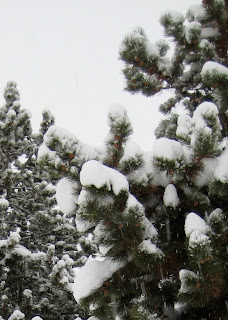
6) Colorado Snow
Original:

Crop:
1) The original has a good sense of proportion and depth and the crop just narrows in on that more
2) The cropping fills the frame better and allows the texture to come out more. Not such a typical landscape
3) The trees farther back weren't necessary at all and neither was the ground.
4) You're able to focus more energy on the clumps of snow on the trees than on the scene as a whole
5) Yes, having foreground and background with sharper vs less focused


No comments:
Post a Comment