Wow. After Effects is reallllly cool and fun to use!
These are my first attempts with the program:
The first is a photo zoom exercise and the second was playing with one of our initials and turning that letter into an action word that starts with the letter.
Tuesday, January 31, 2012


Friday, January 27, 2012
Idea?
So, one of my friends is in the UNT graphic design program and they recently did a project where they took elementary school kid's art and redid it.
The theme was 'monsters' and it was really cute to see what the kid did and then how the design student sharpened it.

The theme was 'monsters' and it was really cute to see what the kid did and then how the design student sharpened it.

Thursday, January 26, 2012
work
I am reallly lucky to have an on campus job that I can do design for. Being the Marketing Intern at Career Services has been great so far because I have fast paced projects all the time so I am constantly making new stuff. It really keeps me experimenting and using anything I've learned in my classes.
This was a fun project that was a big deal since the School of Architecture is really nice and therefore my boss had high expectations for a classy invite that showcased the new building but also had a nice modern design.
I definitely had help from my boss for the overall look, but she was always open to trying a lot of different ideas.
I don't have all the stages on my computer, but here is the final.

I guess I'm most proud that I took the photo and learned a new trick on how to make the text see-through!
Wednesday, January 25, 2012
New Project
I'm working on an idea to make various kinds of ink blot tests...I'd like to of course try ink, but also other mediums like watercolor, photographs, patterns etc.
It's going to take some experimenting, but this is just a type of mood board with a couple ideas:

It's going to take some experimenting, but this is just a type of mood board with a couple ideas:

Tuesday, January 24, 2012

Monday, January 23, 2012
Crop it!
We picked some photos that we had taken and manually cropped them and these are the results!
Questions to answer:
1) How successfully does each crop work?
2) How is cropping an improvement to the original?
3) What unnecessary components in the original have been eliminated through cropping?
4) How has the focal point in each photo changed or been improved?
5) Are the cropped images compositionally well balanced?
Bermuda:
Original:

Crop:

1) I think both crops work, it just depends on the feeling of wholeness or simplicity you are going after.
2) Well, the original gives the viewer an idea about the entire setting while the crop is more about the feeling of serenity and isolation on the water.
3) I took out the beach bank and some of the repetitive buildings because you can still get the same idea by the walkway leading off the image area and how the water gets lights towards the right.
4) Like I said about the extraneous buildings being taken out and the beach line.
5) Rule of thirds is used in the crop to give weight to the right side, while leaving an expanse on the left.
2) Museum Octo
Original:

Crop:

1) The first one is strong because you catch the whole movement of the plastic octopus, but the tighter crop is more about the shapes and positive/negative spaces.
2) The crop gives a detail, which is nice.
3) With the crop, you can still tell it's an octopus. The entire body isn't necessary.
4) The first one's focus is on the form itself while the crop is about the detail.
5) I think the amount of black and octopus balances nicely.
3) Art Stuffs
Original:

Crop:

1) The first one gives a bigger picture of what is taking place while the crop is expressing all of it through one of the objects.
2) Instead of focusing on brands and placement and getting distracted by all of that, the crop lets the viewer flow through the image better and not get stuck on one thing.
3) Eliminating the paint tubes and hint of paint cloth, the piece is simplified.
4) Instead of focusing on each object individually, the crop forces it to become more whole.
5) Well balanced because nothing is in the center and the colors and circular shapes move you around the composition.
4) Ground
Original:

Crop:

1) I think that the main thing for both compositions is that the green leaves stay out of the center, and in both cases they do.
2) The original has multiple things going on and lots of texture so the crop just zooms in on a portion of all of that.
3) The twig and the dirt on the side have been taken off
4) The original is setting an environment whereas the crop is more about the texture.
5) Balanced because lines and textures create movement throughout
5) Boat
Original:

Crop:

1) The original is nice because you get a real sense of scene and action vs stationary but the crop gives a nice feel of art principles like line, color, shadows, etc.
2) Simplicity is key and by selective cropping, the focal point is highlighted
3) The whole ocean and beach is gone, as well as the majority of the boat because it's still a nice composition without all of that
4) You can concentrate on the boat more now that it's cropped and you can then imagine the ocean without having it given to you like the original
5) I feel that since the text comes into the image area and the shadow lines and lines of the boat lead in the opposite direction, it balances
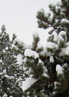
6) Colorado Snow
Original:

Crop:

1) The original has a good sense of proportion and depth and the crop just narrows in on that more
2) The cropping fills the frame better and allows the texture to come out more. Not such a typical landscape
3) The trees farther back weren't necessary at all and neither was the ground.
4) You're able to focus more energy on the clumps of snow on the trees than on the scene as a whole
5) Yes, having foreground and background with sharper vs less focused
Saturday, January 21, 2012
Helping the Sis
My sister is a Microbiology major and has a research project going at the Health Science center in OKC.
She showed me a flyer that had been pre-made by another person in the dept.....


She showed me a flyer that had been pre-made by another person in the dept.....

and asked if I could try my hand at it. I definitely felt the need to break from my own homework to fix that scary and sooo boring flyer. She needs 200 people to volunteer and I doubt she'd get 5 if she had kept that going.
Hopefully this will work a little better for her:

Friday, January 20, 2012
Product Development Exercise
This was an exciting exercise we were given to get us thinking and keep us on our toes.
In the beginning we had 10 minutes to do some brain mapping and get a feel for what direction we wanted to go. Our product was an organic energy drink targeted to 20 year olds.
Healthy, Energy, and College were terms that came to me immediately and so I branched off of those heavily. I'm a big color person as well and just felt that a bright neon or two would make the product feel energized and modern.

Then were given 50 min to try and sketch out 100 packaging ideas. I definitely didn't get to 100, but I did narrow down some bottle designs and come up with a couple product names and slogans.

The final piece of this exercise was to narrow down all the sketches to three in 30 min.
The first one was relatively simple. I like the size and shape of Red Bull cans which people would associate the same size and shape of these to other energy drinks. Then I envisioned this staying a shiny aluminum with a couple bright splashes of neon. The brand name/slogan is "This is a 1 Step Process". I could see people calling it 1 Step. I chose that name because the drink will instantly prepare you for what you need to do. There is no other process to becoming productive.

I then took a different bottling approach by thinking about how this would not only be an organic drink, but healthy to the environment as well. I did some research, and there are organic energy powder mixes. Instead of tons of mass produced cans or bottles, this would be sold initially as a plastic water bottle with a box of powder drink mix and then after the initial sale, consumers would only need to buy powder boxes.
This one is very specific towards college- aged students in that it would be known for its slogans. They are talking directly to the consumer in order to be more personable. The bottle has a direct statement while the packets each have individual questions bringing about how they could possibly need the drink.
I've titled this drink as Mr. Fix It because he comes to your aide when you need him most. His individual slogan is, "I've got you covered." He is reassuring consumers that even if they are heading to a party and then planning to do homework, he will be there for them when they're up late working.

I kept with Mr. Fix It and his slogans but transformed the bottle into the extremely healthy and reusable metal bottles that are becoming popular. "Here to give you a hand" could possibly turn into the main slogan if need be.

Thursday, January 19, 2012
Thursday late night post
GDA is planning to have a Calendar Fundraiser Sale soon and they asked its members to create a one page full calendar.

I had such an amazing group of people for my calendar project and we created a cool piece of work, so I just decided to simplify it a tad and bring it all together for this Sale:

Wednesday, January 18, 2012

Subscribe to:
Posts (Atom)