Wednesday, February 29, 2012

Tarot Further Along

I finally made up my mind on the 22 cards I would like. I based them off of original cards, but then changed about half of them to be more relatable to myself.
And these are the graphics I have so far...gotta get the others done pretty soon.

Tuesday, February 28, 2012

Effective Information Diagram Examples

All of my examples were found in the magazine How It Works.

Their tagline is that they are "The Magazine that feeds minds" and I feel like that is pretty accurate.

Basically every page is a cool information diagram so I was lucky and got to choose ones that I was interested in or that were the best.


This was a very informative graphic about how a GPS and the GPS system in your phone works.
It was interesting to learn how many pieces are a part of figuring out your location and how they all work together.
I feel like the color scheme is one of its biggest successes because if they had more than the monochromatic blues and the one bit of orange it would get overwhelming. As it is, you focus on the orange lines running between the parts and the monochromatic doesn't distract. I also feel like the proportions make it successful because doing realistic proportions would be unrealistic because you wouldn't be able to fit all of the information and still be legible.
The only thing that wasn't working I felt like was the fact that it wasn't numbered by steps. I assumed you just started at the far left, but had to read all of the info boxes to be sure. I think they left out numbers because it's more about the different components and how they work as a whole.


There are two parts to this page on the iPhone:
1) The Anatomy of an iPhone, which is exact photos of the components to an iPhone that was taken apart. I was interested in that, but I was mainly focusing on the side diagram of the screen because it seemed more of an informative piece.

2) Because the touch screen is a relatively new and innovation invention, it was extremely interesting to find out that it actually is comprised of 5 layers! 
Because it is a small sidebar diagram, I feel like it was successful because it was able to incorporate the important pieces and a nice image without feeling cramped or empty of information. It helps that the drawings slightly come out of the bounding box for the sidebar and that they layers have a lower opacity and monochromatic color scheme. 
The arrows are troublesome because you have to go to the bottom to read that the second layer is a protective cover and because the arrows are so long, your eye loses which line you're looking at sometimes...I feel like they could have labeled the layer directly on it without affecting the aesthetics. 


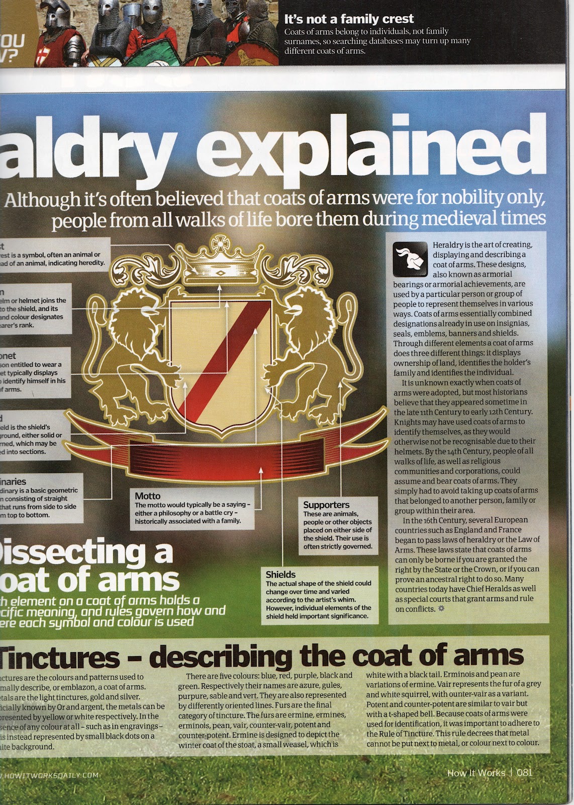
Maybe it's because I've always been a fan of coats of arms, but I thought this was a great spread on the explanation of Heraldry (the art of creating, displaying, and describing a coat of arms).

The details of a coat of arms is very complex and varied, so to have it laid out in divisions was helpful. The main diagram is on the second page, but I thought the first page with the photo and then the simplistic renders of fields and ordinaries was very helpful with terminology and realizing how many options just the shield has before it even gets to the full coat of arms design!


This page was all about "dissecting a coat of arms" and that is what it does. I learned even more of the terminology for a coat of arms and there were pieces that I would have never thought to separate- like at the top with the crest and helm. 
The elaborate illustration along with the the info boxes made it successful. The background is a blurred photo from the left hand side of the page and I don't feel it is too distracting. Some of the placements for the arrows seems a bit strange. It helps that they are in a order starting at the top. 
I feel that overall there is too much text on the entire spread and they could have made more diagrams to help explain. The piece about Tinctures are the colors involved and it would have been nice to see them used. They probably felt that the textual information was more important for those pieces than a visual and they probably felt they picked the most important visuals.


All of these diagrams go with small articles and other diagrams and tid bits and would probably not lend themselves as helpful without the other parts. But they are all still successful and very informative. 

Sunday, February 26, 2012

Portfolio: Rough

I decided to be productive this weekend and start working on a portfolio to send to potential internships/jobs!

I was fairly successful but I still have a couple stuff to add/rearrange/reshoot, but this is what I have so far:


okay, well, the order is completely off, but you get the idea.

Saturday, February 25, 2012

Tarot Round Two

I decided to take a different approach with my back pattern.

I liked the idea of branding the cards and Thorn stuck me (poor pun intended) as a cool name since I feel like Tarot cards themselves can be either painful or pleasant, just like roses with their thorns.
I also liked the geometric feel to them and how the backs can be slightly varied but still go together.

I also brought in more of the color onto the front of the card because I felt like it wasn't enough before. Still feeling iffy on the layout of the front...

Friday, February 24, 2012

Hanging With Friends: Laura's Version

this is my pretty version of the addictive Hanging with Friends


Tarot Sketches

So I have quite a bit more sketches to do...there are 22 total. But this is a start


Thursday, February 23, 2012

Tarot Cards!

I've decided to make Tarot cards, so tonight I worked on a back card design pattern as well as a style for the front...

I love the back pattern because I actually found it by playing with my Type symbols in After Effects. It is actually 4 lowercase 'a's put together!


I want the front very simple and clean, but I'm afraid this might be too simple...
still have some work to do

Tuesday, February 21, 2012

Initial Study

I'm working on a redesign for my resume as well as a business card for DSVC that's coming up sooo I decided I needed to work on a brand for myself.

This is just a start:


I think it's interesting how the two in the middle form "I" or even an exclamation point...can't decide if that's distracting in a bad way though

And these are just figure/ground integrations...


Friday, February 17, 2012

Stitch it Up

I kind of possibly have an obsession with paper stitching...it is very time consuming and sometimes more rewarding than other times...

I decided to play with watercolor and stitching tonight and this is what I came up with:


I did a lot more watercolor sheets but haven't gotten to stitching them yet. 

For those of you who don't know my past stitching pieces...

The first five were my serigraphy final last spring. They are aerial views of airport runways in two colors with hand stitched frames around them. Time spent: 45 hours


A Summer project, I decided to make stitched/watercolored postcards


The very first project we did in Design Tech!


Winter project- geometric forms with stitching!

Thursday, February 16, 2012

repeat


Follow the Craze

Decided to make my own meme (not saying it's funny or especially witty...more cliche than anything), relating to Valentine's Day and my 21st birthday on Tuesday as well


Life


Found some photos I took from the OK State Fair two years ago and decided to put them in a layout

Monday, February 13, 2012

Letterhead & Logo Design 11

A book I picked for this week was by the Design Army.
They had a perfect excerpt to start the book:


There were soo many amazing designs in this book, and I narrowed it down to a few that I really fell for. :)


This Pardon My French bakery was very clever  and I loved how they introduced the graphics with the logo:
 For the company called DCM, this design was so simple but complex at the same time. I liked how DCM was incorporated in all of the animals:

Lizette designed her own stationery and I think the retro feel is unique for such a unique name and I like how the red balls are constant with her first name:

I LOVE THIS ONE! The company is Bright Yellow Jacket, so of course a penguin is wearing a bright yellow jacket! Once the penguin was placed and some strategic yellow as well, it really doesn't need anything else!


This was a nice way to use a letterform symbol for the logo. It makes a very modern M while still giving it some character:


Another designer did her stationery and the bold citron green stripes are wonderful. As well as her identity name :)


This was such a great example of someone into eclectic stuff! The colors were great with the textures and the simple band that flows on all of her stuff is the perfect way to tie everything together:


I'm not too into girly stuff, but these were just classy and had nice shape to them:


Now that I'm doing type, I'm realizing that you can still express so much without showing every single letter and form. And of course, the best way to letterhead and logos is through cleverness. 


:)