Their tagline is that they are "The Magazine that feeds minds" and I feel like that is pretty accurate.
Basically every page is a cool information diagram so I was lucky and got to choose ones that I was interested in or that were the best.
This was a very informative graphic about how a GPS and the GPS system in your phone works.
It was interesting to learn how many pieces are a part of figuring out your location and how they all work together.
I feel like the color scheme is one of its biggest successes because if they had more than the monochromatic blues and the one bit of orange it would get overwhelming. As it is, you focus on the orange lines running between the parts and the monochromatic doesn't distract. I also feel like the proportions make it successful because doing realistic proportions would be unrealistic because you wouldn't be able to fit all of the information and still be legible.
The only thing that wasn't working I felt like was the fact that it wasn't numbered by steps. I assumed you just started at the far left, but had to read all of the info boxes to be sure. I think they left out numbers because it's more about the different components and how they work as a whole.
There are two parts to this page on the iPhone:
1) The Anatomy of an iPhone, which is exact photos of the components to an iPhone that was taken apart. I was interested in that, but I was mainly focusing on the side diagram of the screen because it seemed more of an informative piece.
2) Because the touch screen is a relatively new and innovation invention, it was extremely interesting to find out that it actually is comprised of 5 layers!
Because it is a small sidebar diagram, I feel like it was successful because it was able to incorporate the important pieces and a nice image without feeling cramped or empty of information. It helps that the drawings slightly come out of the bounding box for the sidebar and that they layers have a lower opacity and monochromatic color scheme.
The arrows are troublesome because you have to go to the bottom to read that the second layer is a protective cover and because the arrows are so long, your eye loses which line you're looking at sometimes...I feel like they could have labeled the layer directly on it without affecting the aesthetics.
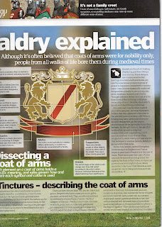
Maybe it's because I've always been a fan of coats of arms, but I thought this was a great spread on the explanation of Heraldry (the art of creating, displaying, and describing a coat of arms).
The details of a coat of arms is very complex and varied, so to have it laid out in divisions was helpful. The main diagram is on the second page, but I thought the first page with the photo and then the simplistic renders of fields and ordinaries was very helpful with terminology and realizing how many options just the shield has before it even gets to the full coat of arms design!
This page was all about "dissecting a coat of arms" and that is what it does. I learned even more of the terminology for a coat of arms and there were pieces that I would have never thought to separate- like at the top with the crest and helm.
The elaborate illustration along with the the info boxes made it successful. The background is a blurred photo from the left hand side of the page and I don't feel it is too distracting. Some of the placements for the arrows seems a bit strange. It helps that they are in a order starting at the top.
I feel that overall there is too much text on the entire spread and they could have made more diagrams to help explain. The piece about Tinctures are the colors involved and it would have been nice to see them used. They probably felt that the textual information was more important for those pieces than a visual and they probably felt they picked the most important visuals.
All of these diagrams go with small articles and other diagrams and tid bits and would probably not lend themselves as helpful without the other parts. But they are all still successful and very informative.


No comments:
Post a Comment